

What Actually Matters When Building a Travel Booking Website in 2026
I was looking through an old client website a few weeks ago and honestly it reminded me how much the travel industry has changed.
Ten years ago most travel companies only wanted a simple website. A few destination pages, some contact information, maybe a gallery and a contact form. That was enough.
Today people expect much more.
They want to compare tours, check availability, browse on mobile, see real photos, read reviews, and sometimes complete a booking without ever speaking to a sales person.
The problem is that many travel businesses are still running websites built for a completely different internet.
I recently helped a small tour operator rebuild their booking website. Their old site wasn't broken, but it wasn't helping the business either. Traffic was coming in from Google, yet bookings stayed low. After spending a few hours looking through analytics and server logs, the reason became obvious.
Visitors were leaving long before reaching the booking page.
The homepage looked fine.
The photos looked fine.
The issue was the experience.
The average visitor had to click through several pages before finding tour details. Mobile users had an even harder time because important information was hidden behind sliders and popups.
What surprised the owner was that fixing the problem had very little to do with marketing.
Most of the improvement came from simplifying the website structure.
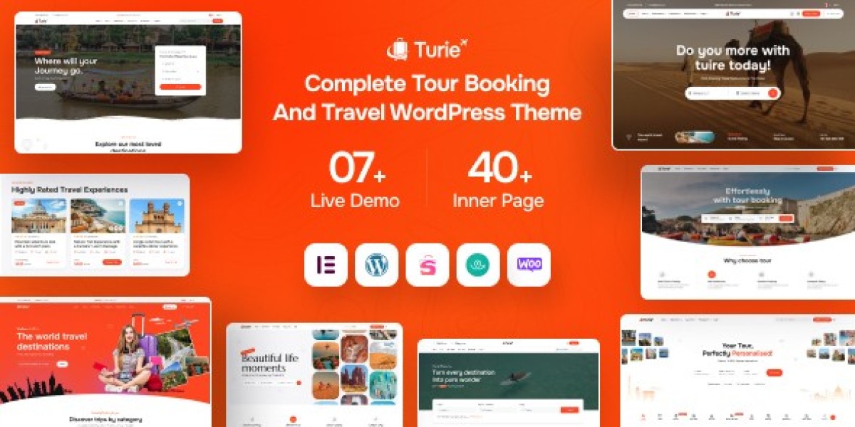
For that project, I ended up testing several travel-focused WordPress themes. One of them was Turie - Modern Travel & Tour Booking WordPress Theme.
What caught my attention wasn't the homepage design.
I've learned not to judge themes by homepage demos anymore.
Theme demos are built to impress buyers, not necessarily real visitors.
Instead, I looked at things that actually affect day-to-day management.
Can staff add tours quickly?
Can customers find pricing easily?
Can destination pages rank in Google?
Can the site remain manageable after adding hundreds of tours?
Those questions matter much more than fancy animations.
One thing I often tell new website owners is that travel websites are basically content machines.
Every tour becomes a page.
Every destination becomes a page.
Every travel guide becomes a page.
Every customer story becomes a page.
After a year or two, a growing travel website can easily have hundreds or even thousands of URLs.
That's where many projects start falling apart.
The owner focuses on design while ignoring structure.
Then six months later nobody can find anything.
When we rebuilt that client project, the first thing I changed wasn't the design.
I changed navigation.
That sounds boring, but it produced some of the biggest improvements.
Instead of organizing tours based on internal company categories, we organized them based on how customers search.
Nobody searches for "Premium Package Group A."
People search for things like:
Family Tours.
Weekend Trips.
Adventure Travel.
Luxury Travel.
Small Group Tours.
The difference seems small, but it changes how visitors move through the website.
Google understands it better too.
A lesson I've learned after building many WordPress sites is that good SEO usually starts with good organization.
Most site owners immediately think about keywords.
Keywords matter, but if users cannot navigate the website easily, rankings alone won't save conversions.
During the project I also spent a lot of time cleaning up old plugin clutter.
This is another issue I see constantly.
A website owner installs plugins for years and never removes anything.
Eventually the site is running fifty plugins when only fifteen are actually needed.
The result is predictable.
Slower performance.
More conflicts.
More updates.
More security risks.
Whenever I start a rebuild, I create a spreadsheet listing every active plugin and asking one simple question.
Does this plugin still solve a real problem?
If the answer is no, it gets removed.
Many useful tools can still be found through collections like Essential Plugins but I always remind clients that more plugins do not automatically mean a better website.
A travel business needs efficiency.
Not plugin trophies.
One thing that really helped the project was improving page speed before launch.
I know speed optimization is discussed everywhere, but many people still approach it incorrectly.
They install a cache plugin and assume the job is done.
In reality, speed issues often start with images.
Travel websites are image-heavy by nature.
Large destination photos look beautiful, but they can also destroy loading performance.
For this project we resized every image before upload.
Nothing complicated.
No expensive software.
Just basic optimization and common sense.
The result was noticeable immediately.
Mobile pages loaded faster and server resource usage dropped.
Sometimes the simplest fixes create the biggest wins.
Another area where travel websites struggle is content creation.
Most tour operators eventually discover they have dozens of nearly identical pages.
One page for Paris.
One page for Rome.
One page for London.
One page for Barcelona.
The temptation is to copy and paste content while changing a few words.
That approach worked many years ago.
Today it rarely helps.
Google has become much better at identifying repetitive content.
Instead, I usually encourage clients to write about actual experiences.
Share what travelers should know before visiting.
Explain common mistakes.
Discuss transportation.
Talk about local food.
Mention seasonal differences.
Answer real customer questions.
That kind of content tends to perform much better over time because it offers something unique.
I've seen small travel blogs outrank giant companies simply because their content came from genuine experience.
The same principle applies to product pages.
A tour description shouldn't sound like a brochure.
It should sound like advice from someone who has actually been there.
When users feel that authenticity, trust increases naturally.
Trust is something many website owners underestimate.
Visitors don't decide within ten minutes whether they trust a company.
They decide within seconds.
The layout matters.
The wording matters.
The speed matters.
The contact information matters.
Even small details matter.
A missing phone number.
A broken image.
An outdated copyright year.
All of those things create doubt.
When I audit websites, I spend as much time looking for trust problems as I do looking for SEO issues.
Sometimes fixing a few trust signals produces more bookings than months of keyword research.
One interesting thing happened after we launched the rebuilt travel website.
Traffic didn't explode overnight.
In fact, for the first few weeks traffic barely changed.
The owner was worried.
He expected instant growth.
I told him to wait.
Search engines often need time to process large structural changes.
About two months later, destination pages started gaining visibility.
Then blog articles began receiving long-tail traffic.
Then bookings increased.
Not because we discovered some secret SEO trick.
Not because we purchased backlinks.
Not because of any magical plugin.
The website simply became easier for people and search engines to understand.
That's something I've noticed repeatedly over the years.
The websites that perform best usually aren't the most complicated.
They're the clearest.
Visitors know where to go.
They know what to do next.
They know how to contact the business.
Everything feels straightforward.
That's what most travel websites should aim for.
Looking back at that project, the theme itself was only part of the solution.
The bigger improvement came from planning, organization, performance work, and better content.
Technology helps, but technology alone rarely fixes business problems.
If someone asked me today what makes a successful travel booking website, my answer would be simple.
Make it easy for visitors to find information.
Make it easy for them to trust you.
Make it easy for them to book.
Everything else is secondary.
After more than a decade working with WordPress, those three things still matter more than every design trend I've seen come and go.
For anyone planning a new travel website this year, that's where I would start. Not with colors, animations, or homepage sliders.
Start with the customer journey.
The rest becomes much easier after that.