Run Wrake wasn’t just an illustrator or an animation director—he was a storyteller who spoke in bold shapes, cut-out collage, and rhythm. If you’ve ever seen his short films, you’ll know the feeling: a rush of visuals that feels playful and unsettling at the same time, like a dream stitched together from vintage ephemera and pop culture. Run Wrake film prints capture that exact energy—single frames and developed visuals taken from his moving images and production art, frozen long enough for you to live with them on a wall.
What makes a Run Wrake film print special?
Wrake’s visual language is instantly recognizable. He loved layering found imagery with hand-drawn details, typography, and graphic symbols, then animating them with a musical sense of timing. On screen, that language moves like a beat; on paper, it becomes a dense, satisfying composition you can parse at your own pace. A film print might show a character mid-gesture, a surreal juxtaposition of objects, or a snapshot where text, pattern, and picture collide. Even without sound or motion, you can feel the pulse of the original scene.
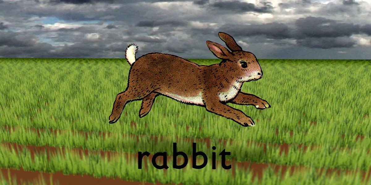
Many collectors first meet Wrake through Rabbit (2005), the short film that distilled his style into a clever, dark fable. Frames from work like this, along with concept art and title treatments from his animation projects and broadcast pieces, translate beautifully to print. They’re graphic, narrative, and a little mischievous—perfect for anyone who likes art with personality.
From motion to paper: why the transition works
Not every animation frame makes a good print. Wrake’s do because his compositions were designed to read quickly and powerfully. He thought like a designer and an editor at once: every cut, every object, every word was chosen for rhythm and impact. As prints, those same scenes become visual puzzles you can revisit. The layered approach—vintage catalog cuts next to bold color blocks, clean lines next to rough textures—creates depth that rewards close viewing.
For fans of music, design, and pop culture
Wrake’s career ran through music culture—NME illustrations, MTV stings, collaborations and visuals that defined a generation’s taste. That spirit is alive in his film prints. They feel like show posters for stories that never stop playing in your head. Hang one in a studio, a living room, or a listening room and it changes the mood: playful but sharp, nostalgic but modern. People who love record sleeves, zines, or experimental animation connect with these prints immediately.
Limited editions, quality, and care
Most reputable releases of film prints are produced to gallery standards: archival inks, heavyweight acid-free paper, and a limited edition with an artist or estate stamp or signature (where available). That matters. The crispness of Wrake’s lines, the grain of scanned textures, the offbeat color palettes—they all depend on proper printing. If you’re collecting, look for details such as the edition size, paper stock, and provenance. A certificate of authenticity or clear estate documentation helps ensure you’re getting a legitimate piece.
For framing, simple always wins. A white or off-white mat with a thin black or natural wood frame keeps attention on the image. UV-protective glazing is a wise upgrade, especially if the print hangs in a bright room. Keep it away from direct sunlight and fluctuating humidity to preserve color and paper integrity over time.
Curating a small series at home
One print makes a statement; two or three can tell a story. Consider pairing a bold, central character frame with a more typographic still, or mixing a moody scene with a brighter, graphic composition. Wrake’s pieces often share visual motifs—arrows, numbers, labels, retro clip art—so they naturally “talk” to each other on a wall. If you’re building a gallery, alternate sizes and leave comfortable breathing room; Wrake’s dense imagery benefits from space.
Why artists and designers love these prints
Designers, animators, and illustrators often cite Wrake as a touchstone because he showed that smart ideas and raw materials could become something sophisticated and fresh. His film prints feel like lessons in visual thinking: contrast quiet with loud, pair the polished with the rough, let humor sit next to tension. Hang one near your desk and it becomes a reminder to take risks, to edit ruthlessly, and to keep the fun in the work.
A living legacy
Run Wrake passed away in 2012, but his influence is still loud—on screens, in studios, and in the collections of people who love art that breaks neat categories. Run Wrake film prints are more than souvenirs of a cult favorite; they’re living objects that keep his spirit in motion, even when the frame stands still. Whether you’re a long-time fan or just discovering his world, bringing one of these prints home is like inviting a small burst of creative electricity into your space—clever, bold, and impossible to ignore.