In today’s digital era, social media presence can make or break personal brands, businesses, and creative projects. Among the many elements that shape how your profile is perceived, the Facebook banner plays a pivotal role. Often the first visual impression a visitor gets, your banner sets the tone for your page or profile. But to make that impact truly effective, understanding Facebook banner dimensions is essential.
In this guide, we will explore everything you need to know about creating eye-catching banners, optimizing them for different devices, and using the correct dimensions to enhance your social media strategy.
Why Facebook Banner Dimensions Matter
Many users underestimate the importance of banner size. A poorly sized image can appear blurry, cropped awkwardly, or fail to convey your intended message. Facebook’s platform is dynamic and responsive, which means the same banner will look different on desktop, mobile, and tablet devices.
Using the correct Facebook banner dimensions ensures:
Clarity and sharpness: Avoid pixelation and distorted images.
Proper framing: Ensure that your key elements (text, logos, visuals) are visible across all devices.
Professional appeal: Well-optimized banners reflect professionalism and attention to detail.
Think of your Facebook banner as the digital equivalent of a billboard—only smaller, yet highly influential. With the right dimensions, you can make your first impression count.
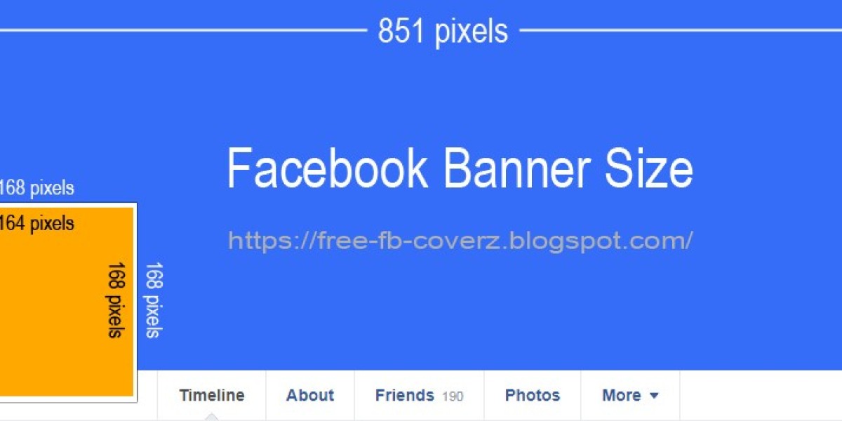
Standard Facebook Banner Dimensions
As of 2025, the recommended Facebook banner dimensions are:
Desktop display: 820 pixels wide by 312 pixels tall
Mobile display: 640 pixels wide by 360 pixels tall
Notice the difference? This discrepancy occurs because Facebook crops banners differently depending on the device. Therefore, designing with a “safe area” in mind is crucial.
The “Safe Zone”
The safe zone refers to the central portion of your banner where essential visuals and text should be placed. For Facebook banners, the safe zone generally measures 640 pixels by 312 pixels, ensuring that nothing critical is cut off on mobile or desktop views.
Designers often use grids or guides in graphic design tools like Canva, Photoshop, or Figma to mark this area, preventing accidental cropping.
Recommended File Formats and Sizes
Choosing the right dimensions alone isn’t enough. The file format and size play a significant role in how your banner appears:
File formats: JPG or PNG are preferred. PNG is ideal for logos or text-heavy designs because it preserves sharpness.
Maximum file size: Facebook supports up to 100 KB for optimal loading speed. Large files may slow down your page or compress automatically, causing blurry images.
Using the correct format and file size ensures that your Facebook banner dimensions display crisply and professionally.
Tips for Designing an Effective Facebook Banner
Beyond dimensions, creating a compelling banner involves design strategy. Here are some tips:
1. Keep It Simple
Too much text or cluttered visuals can overwhelm viewers. Focus on a clear, concise message that complements your profile or brand.
2. Maintain Brand Consistency
Use your brand colors, fonts, and style to create a cohesive look. Your banner should instantly reflect your identity and resonate with your audience.
3. Optimize for Mobile First
Since most users access Facebook via mobile devices, prioritize mobile-friendly designs. Ensure that critical text and imagery remain visible within the mobile safe zone.
4. Use High-Quality Images
Pixelated or stretched images give a poor impression. Choose high-resolution images and graphics that scale well to Facebook’s banner dimensions.
5. Test Before Publishing
Preview your banner on multiple devices. Facebook allows you to upload and adjust positioning, but testing beforehand helps avoid unwanted surprises.
Common Mistakes to Avoid
Even experienced designers sometimes stumble. Here are frequent pitfalls to watch out for:
Ignoring the safe zone: Essential visuals get cropped on mobile or desktop.
Overloading with text: Less is more; banners should capture attention quickly.
Using low-resolution images: Causes pixelation and reduces credibility.
Not updating seasonally: A banner that reflects outdated promotions or irrelevant visuals can harm engagement.
Avoiding these mistakes ensures that your Facebook banner dimensions work for you, not against you.
Leveraging Facebook Banner Dimensions for Engagement
A well-optimized banner isn’t just about aesthetics; it’s a powerful tool for engagement. Here’s how to make the most of it:
Highlight promotions or events: Temporary campaigns can be featured prominently without altering the core brand identity.
Tell your story: Use banners to communicate your values, mission, or creative work.
Drive traffic: Incorporate subtle calls-to-action, guiding visitors to click through to your website or other platforms.
By aligning your design with Facebook’s recommended dimensions, you ensure that your banner appears consistently and effectively across all screens.
Future Trends in Facebook Banner Design
Social media platforms are evolving rapidly. While static banners remain the standard, dynamic and interactive designs are gaining popularity:
Animated GIF banners: Capture attention with subtle motion without overwhelming the viewer.
Video headers: Facebook supports video content in certain profiles, offering an immersive experience.
AI-assisted design: Tools powered by AI can optimize layout, colors, and typography automatically, ensuring your banner fits perfectly within recommended dimensions.
Staying ahead of these trends means your Facebook presence will not only look professional but also feel contemporary and engaging.
Conclusion: Making Your Banner Work for You
Understanding Facebook banner dimensions is more than a technical requirement—it’s a strategic advantage. Your banner is the first visual cue people notice, and it can make the difference between a casual visitor and a loyal follower. By adhering to the recommended dimensions, respecting the safe zone, and designing with clarity and engagement in mind, you maximize your social media impact.
As the digital landscape evolves, the question remains: how will your Facebook banner reflect your brand in an era of mobile-first, interactive, and AI-driven experiences? The power is in your hands to adapt, experiment, and captivate.